Menu changes, slight UI changes, player sprite changes
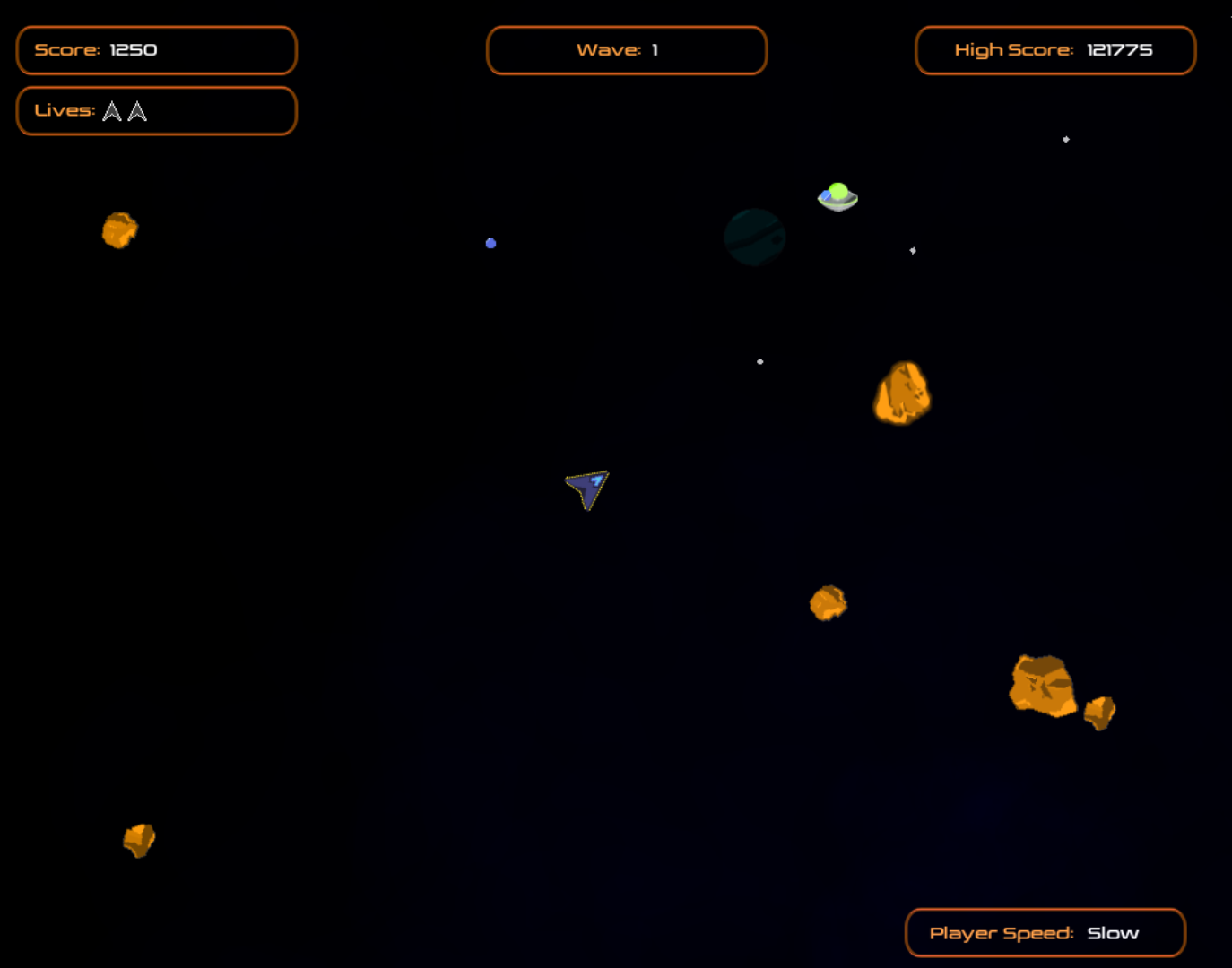
A lot has changed with this release of Fasteroids. Over the past few weeks I've been working on coming up with a new player sprite. I streamed some of the initial attempt, an SR-71-like image I worked on in Aseprite, before I ended up pitching the idea and sticking with the traditional Asteroids-ship shape, but adding some colour and girth to the ship. The orange halo (temporary invincibility when you first start) around the ship in this screenshot actually looks better on screen than in the screenshot below. I've also slightly changed the elements around the score, wave, high score, lives, and player speed. The change is the very subtle addition of colour in spots that give the UI a better feel. I also changed the text in each UI so the element (Score, Wave, High Score, Player Speed) are all orange, but the actual score, wave, high score and player speed are set in white text. Very subtle changes.

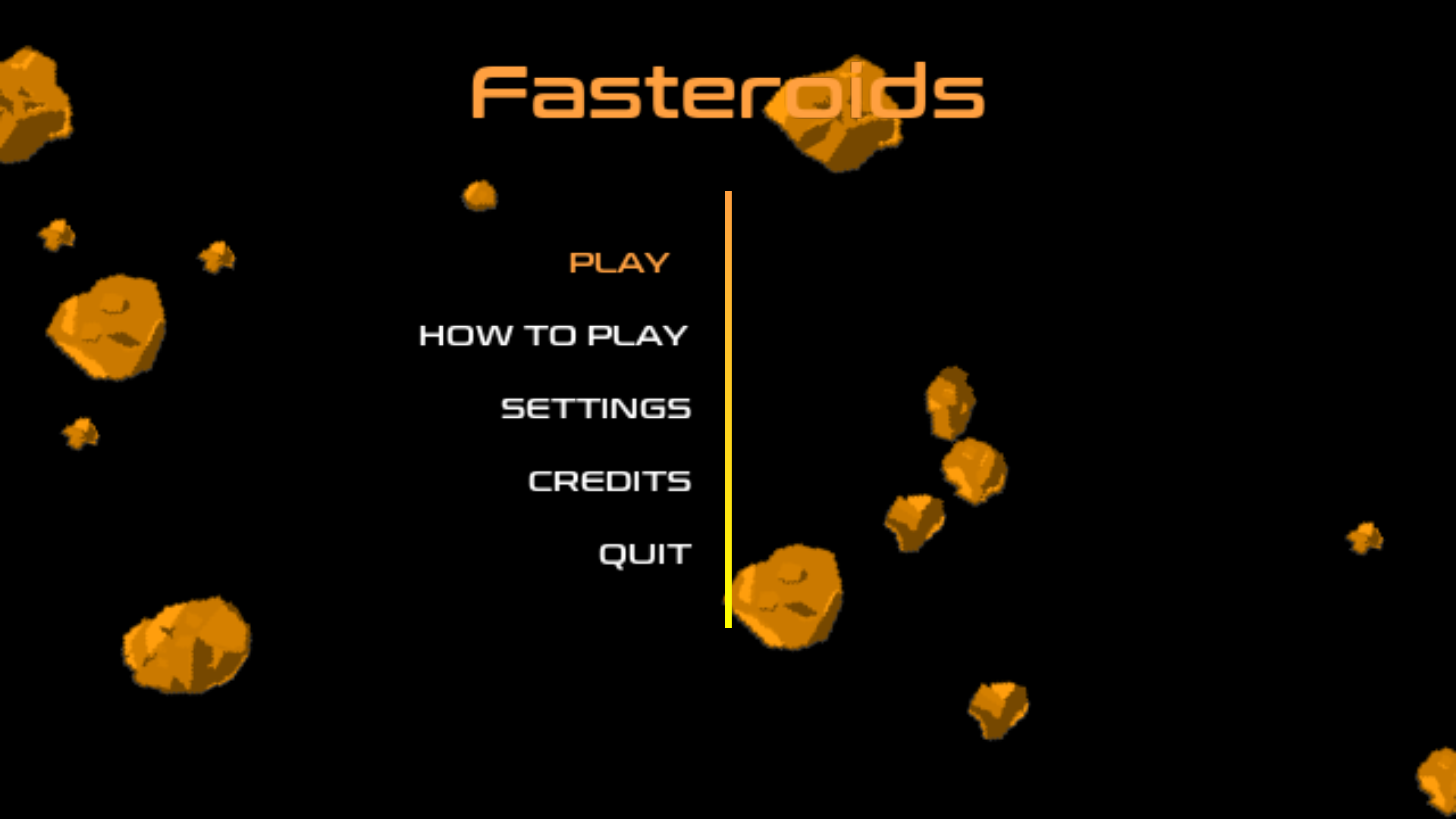
The biggest change is to the menu systems. I got rid of the player ship on the menus, centered all the menu text, increased the font size, changed the font style, and added text to show what menu you're at (Main menu, settings, etc.). Menus are going to change again in the future. Right now I've created a bunch of sub menus and over-complicated things a bit.
Settings includes Difficulty, Sound, Main Menu, and Quit. The Escape key will also take you to the main menu. But if you want to quit, you can press Q on the Settings menu to quit.
Under the Difficulty menu there's now some options: Player Speed, Asteroids, UFOs, Main Menu, and Quit. Currently Asteroids and UFO menu options do nothing, they're just placeholders. Player Speed goes to another menu that lets you adjust the game speed from Slow to Normal, Fast, or Insane. Main menu will take you to the main menu, which is actually 2 levels up from this menu (if you hove over the option then hit enter). This is a subtle point, if you press the Escape key it will actually only take you 1 level back up to the Settings Menu, not the main menu. A lot of people like to Escape out of things, and this is a natural behaviour to go one level up. Q will quit the game at this menu as well.
Currently the difficulty menu jumps to another menu for the player speed. This is one of the things that I'm going to change. I'm planning on making this, the asteroids and the ufo's options all sliders on the difficulty screen. I'm not a fan of going 10 levels deep to find something, but 1 or 2 is okay.
Please enjoy this latest release (1.8) and let me know if you run into any issues.
It's worth mentioning that Fasteroids needs a 1024x768 screen, so if you're in a virtual machine, make sure you can do 1024x768.
Files
Get Fasteroids
Fasteroids
Continuously developed remake of Asteroids for Linux & Windows
| Status | In development |
| Author | Chaslinux |
| Genre | Action |
| Tags | Arcade, Asteroids, atari, fasteroids, Pixel Art, Retro, Shoot 'Em Up, Singleplayer, Space |
| Languages | English |
More posts
- Bug (crash) fixes, HTML version, Linux AppImage, and full screen versionFeb 05, 2025
- Working on 2.40 resolution changesJul 21, 2023
- Fasteroids 2.39 - resolution switch cleanupJul 07, 2023
- Fasteroids 2.38 updated for future resolution changesJul 06, 2023
- Fasteroids 2.36 ReleasedNov 04, 2020
- Fasteroids 2.35 Released!Oct 28, 2020
- Fasteroids 2.33 ReleasedSep 25, 2020
- Main ship updated, bug fixes and correctionsSep 24, 2020
- Major overhaul of in-game UI and menu systemApr 17, 2020
- Big menu changes coming...Apr 15, 2020

Leave a comment
Log in with itch.io to leave a comment.